//
Oct 3, 2016
Smart Marketing Design: What is Your Font Really Telling Consumers?
We’ve probably all heard the saying, “a picture’s worth a thousand words.”
While pictures show us additional visual information, the appearance of the words themselves, or the typeface you choose, can have a huge impact on how your message is relayed to consumers. There are thousands of fonts to choose from, so how do you know which is the best typeface to create a smart marketing design?
Choosing a font depends on the message you want to send to your customers. Is this message serious or fun and playful? In addition, it’s important to always keep your business’ brand persona in mind, so that the typeface you choose stays true to your business personality. Design is History helps break down font categories in their . To make choosing a typeface easier, we’ll break down the four basic typeface categories.
SERIF
Serif-style fonts are easily identifiable by their serifs, which are strokes or curves on the tips letters—almost like a tail. These fonts have a transition of thick to thin, called a thick/thin transition, within the letters and are considered to be more classic and traditional. Serif-styles can be broken down into three general font types: oldstyle, modern, and slab.
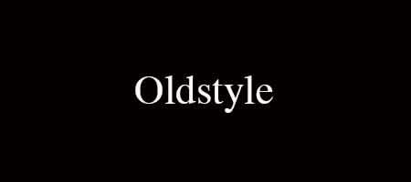
Oldstyle typefaces were originally based on the handwriting of scribes. These fonts have work best for large amounts of body copy because they have a diagonal stress with their thick/thin transition as well as their serifs, which makes them easy to read. For example, one of the most popular oldstyle fonts is Times:
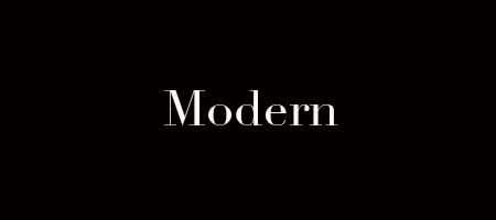
Modern typefaces are also modeled after pen strokes. The biggest difference is that modern fonts have horizontal serifs, and their thick/thin transition has a vertical stress. Modern typefaces have very strong thick/thin transitions, which makes them harder to read in large amounts of body copy. These fonts work best when set at a very large size for smaller amounts of text. For example, Didot is a modern font:
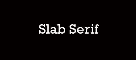
Slab typefaces differ the most from the other two serif styles. These fonts became popular during the industrial revolution with the birth of advertising. Slab styles contain a thicker letterform with a vertical stress, which nearly eliminates the thick/thin transition. For example, Rockwell is a slab serif font:
SANS SERIF
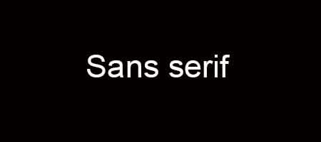
In French, “sans” means “without.” Sans serif typefaces are those without serifs. These fonts became popular during the early 20th Century and are typically monoweight, which means they contain no thick/thin transition. Sans serifs are typically viewed as cleaner, more modern typefaces. Two of the most common sans serif fonts are Arial and Helvetica. You can see Arial below:
SCRIPT
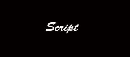
Script typefaces are those that look as though they’ve been drawn out by hand with a calligraphy pen or brush. They often resemble handwriting and emulate calligraphic styles. However, script fonts should be used sparingly, and never in all capitals. They are often difficult to read in long passages because of their intricate designs, but when set to a large size for short text, such as a title, they can really draw attention.
DECORATIVE
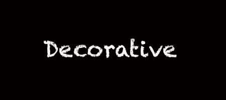
Decorative typefaces are the fonts that catch your attention and make you say “Wow. That’s an cool font!” These fonts are extremely distinctive and eye-catching, but your best bet is to use them for titles and never for long stretches of text. They easily carry emotions and can imply meaning stronger than other typefaces. For example, chalk duster is a decorative font:
Your typeface choice says a lot about your business’s personality and helps set a tone for the message your are relaying to consumers. When it comes to communicating with your consumers, the typeface of your message is just as important as the content and wording. By using smart marketing design, you can find a font that also fits your business’s brand persona, which will unify each of your messages and help build your relationship with consumers.


