//
Jul 19, 2017
4 Steps for Logo Redesign
Your company’s logo is the visual representation of who your company is, and just like your company evolves over time, so should your logo.
Today, marketing incorporates much more digital, visual, animated, emotion-evoking strategies, so it’s important for your logo redesign to be able to translate well between these platforms. There are many benefits of updating your logo, so to help you simplify the process, here are four steps for a logo refresh.
STEP 1: KEEP UP WITH THE TIMES
Much like fashion, logo design follows trends—color, fonts and use of icons all come into play when considering a logo refresh. This may mean a few small tweaks to your existing logo or a complete overhaul, depending on how old your logo is and how much your company has evolved.
Of course, that’s not to say that just because your competitors are all using green, you need to as well. The elements of your new or refreshed logo need to reflect your brand, not your competitors’; therefore, it’s often best to start by taking a close look at your brand and target audience—which brings us to the next step to consider.
STEP 2: KEEP IT MEANINGFUL
Instead of redesigning your logo just for “the sake of change,” there should be strategy behind your redesign. Before opting for an update or complete redesign, consider the following:
- Has your company’s target audience changed over time?
- Has your company expanded its services/products to new areas where your logo hasn’t been seen before?
- Did an amateur design your original logo on a shoestring budget, and you’re now in the position to put the thought, energy and funds into a memorable, meaningful logo that really communicates who you are now?
If you answered “yes” to any or all of these questions, then your logo is most likely due for an update. If you answered “no” to any or all of the questions, your logo may still benefit from a redesign, but you may also want to consider other digital marketing strategies to promote your brand.
RELATED:
STEP 3: KEEP IT SIMPLE
Today’s logos need to be conducive for digital applications, which means the less complex it is, the more memorable it will be. Too many colors, gradients or intricate details within a logo will not translate well when represented in digital formal. For example, a vibrant gold color on your business card can translate to a dirty mustard yellow on your website.
Consistency in appearance whenever and wherever your logo is seen, is the number one rule in logo redesign! This not only applies to the colors within your logo, but also the overall design itself. While intricate lines and delicate typeface may look crisp on a printed piece, it may appear too busy when displayed digitally—especially on a smaller mobile device. Clear, concise simplicity within your design is key.
RELATED:
STEP 4: KEEP IT RECOGNIZABLE
When you start a business, you build relationships with consumers. Your customers have come to know your brand and logo (for better or worse!). Therefore, unless you’re starting from scratch and renaming your company (which calls for a total rebrand, not just a new logo), a well-redesigned logo retains the elements that have become familiar and been ingrained in your audience’s mind.
For example, consider McDonald’s . While the logo elements have been updated over time, once they were introduced in the 1970s, those famous golden arches have remained the constant (You can see other successful logo redesigns ).


Photo source:
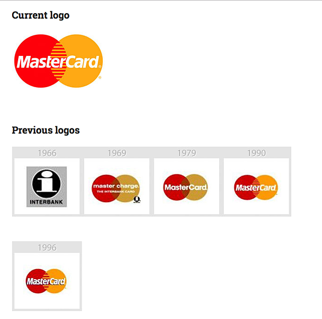
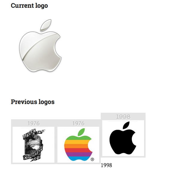
In addition, both MasterCard and Apple are good examples of keeping consistency and retaining familiar elements. After an initial redesign in the beginning stages of business, both companies have refreshed their logo with small tweaks and changes. Through each logo update, MasterCard has kept it's signature red and yellow circles, and Apple has kept it's apple shape.
With a strong understanding of your brand and experienced design team, you can develop a fresh, yet familiar face for your brand. A updated logo will give a fresh look to your website and social media presence, as well as project an image of relevance and evolution to your customers. If you follow the above steps, your logo redesign will:
- Communicate a fresh, energetic, progressive attitude that will resonate in customers’ minds
- Be distinctively memorable as a result of strategic forethought before pencil is ever put to paper
- Translate well over multiple marketing vehicles, including digital and print media
- Take the best of your existing logo and transform it to express your growing and evolving brand


