//
Jul 28, 2022
How to Create a Squeeze Page That Converts
Do you want to increase conversions? Then you need a squeeze page. Here's why.
What are squeeze pages, and do they work?
A squeeze page's (a.k.a. a landing page) purpose is to get you to take action—like signing up for a free trial, downloading gated content, or making a purchase.
It's called "squeezing" because it's supposed to be tight and compact, with only the most essential information.

A squeeze page is a that drives traffic from other pages, such as an ad, email, or social media post. The goal of this landing page is for the user to take action—like filling out a form or giving you their email address—so you can contact them later with more information about your product or service.
Why you need a squeeze page
The best way to get in front of your is to create an ad campaign that targets those customers directly.
Spend some time researching: who they are, what they're interested in, and how you can reach them. Once you know this information, creating ads that target those people can be very effective. But what happens when someone clicks on your ad but doesn't end up buying anything? Or worse yet: what if they don't give you any information? How do you follow up with them?
That's where squeeze pages come into play! While designed to drive traffic from other sources, squeeze pages also collect the information from those visitors so that you can follow up with them later if necessary.
In addition, forms can help improve customer service by providing helpful information about your customers and leads.
What to include on your squeeze page
To make your squeeze page for Inbound marketing successful, you must include the right elements. To do that, you'll need to know what works. That's why we've put together this guide to help you create a squeeze page that will convert your visitors into leads and customers.
Optimizing your squeeze page for conversions is the best way to ensure your Inbound marketing campaign is successful.
A lot of people skip this important step because they think they don't have time or money to put into it. But it's worth the investment if you're serious about increasing your sales and conversions through Inbound marketing!
The first thing you should do when designing your squeeze page is figure out what information you need to include before someone signs up for whatever service or product you're offering. Then start thinking about what questions need answering before they'll sign up for that service or product.
For example:
If someone wants to download your ebook, what do they need from it? What problem does it solve? How many pages will there be? What will each chapter cover? How much will it cost them?
Once you know those things, you can begin designing and building your squeeze page. Make sure your landing page has the following:
- Smart Web design elements are clean, clear, concise, visually appealing, and intuitive.
- Short, to-the-point copy
- Seamless web development elements that work with the rest of your website and
Let's start with web design elements.
What to include when designing your squeeze page:
When designing your squeeze page, your design team should always ensure that the landing page's design is clean, clear, concise, visually appealing, and intuitive. Make sure to include:
- Images:
Images help tell the story behind what you're selling or offering and can also help set the tone for what kind of experience users should expect from interacting with your brand or product.
You'll probably want multiple images on each squeeze page—one large image that takes up most of the space at first glance and then smaller thumbnails below it.
- Social media icons and contact information:
It's wise to include your company's social media platform icons and general contact information to make it easy for leads to reach out and connect with your sales and customer service teams.
What should the text look like on your squeeze page design?
Regarding text, two things matter most: fonts and formatting.
- Fonts:
You may not realize it, but fonts can make or break your squeeze page. When choosing fonts, make sure they're easy to read because people don't like reading tiny text—especially when trying to find out if they should buy something from you!
The best fonts for your squeeze page are easy to read and stand out from the rest of your website. If you're using a standard serif font, like Times New Roman or Arial, make sure to use a different sans-serif font.
Focusing on text, fonts, and formatting on your squeeze page will help you stand out from the crowd and keep your readers focused on the most important parts of your text—the parts that matter most to them!
- Formatting:
And when it comes to formatting, keep it simple. Don't use too many different font sizes, and don't try anything fancy with your paragraphs or bullet points—it just looks sloppy! Instead, use a single-column format with no more than two or three lines per paragraph. If you want to add images or videos, make sure they're related to what you're discussing in the text. If not, consider moving them elsewhere, so they don't distract from the main message.
You want your visitors' eyes on the prize: what's in it for them?
Web development elements that need to be on your squeeze page
- A call-to-action button (CTA):

This button should be prominent on your squeeze page and easy for your customers to find and complete their action—whether it's signing up for a free trial, downloading an ebook, or sharing content on social media.
Make sure your CTA is clear about what action it will take when clicked: "Sign Up" versus "Get Started" versus "Try It Out."
Make sure you don't use more than one CTA per page; otherwise, people may get confused about which one they should click!
- Gated content with a form:
The point of a squeeze page is to capture the attention of qualified leads, but you have to have a way to know who's landing on your page, right? That's why you'll always need to include a form for your visitor to fill out with their contact information to unlock the gated content or offer your squeeze page targets.
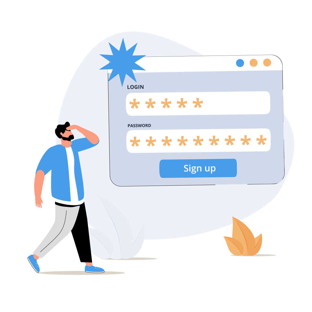
TIP: Always ensure you've got a robust CRM connected to the forms on your squeeze page to trigger workflows and the segmentation of leads. Not sure how to do this?
- Post-Conversion Page:
This page might be even more critical than your squeeze page! Once a visitor fills out the gated form and unlocks your offer, send them to a post-conversion page that thanks them for completing an action they've taken, such as signing up for your email newsletter, downloading a white paper, or watching a video.
Sometimes a 'thank you is enough for simple conversions like filling out a form.
Create a success page and follow-up email workflow for high-value conversions like making a purchase.
Other times, if the end goal of your squeeze page is click-action conversion, your post-conversion is innate as it guides your lead to another page on your website.
Now you see how vital a squeeze page is to your overall Inbound marketing strategy, but does your team have the time and resources to launch such a page?
Consider looking into an Inbound marketing agency to help you deploy your campaign and improve conversions!
About Watermark:
As an inbound-driven marketing agency, we strive to captivate your audience and elevate your brand through Smart Design and Creative Solutions. We believe marketing is a collaborative effort, achieved by practicing agility and working cohesively with your team, not for it. Using data-driven solutions, we implement the best practices necessary to help your business exceed KPIs.
Take your marketing to the next level with a free assessment:
Ready for a solution? Let's talk!


