//
Mar 10, 2021
How To Evoke Emotion With Type
2020 was a year full of disconnect, mental and physical. Sometimes, the only connection to the outside world was through technology. That tiny screen in your hand acted as a window for so many people trying to stay connected with the people and world around them.
So, what happens when you’re glued to your screens for almost an entire year? For some, this means looking to the past for that nostalgic pleasure of simplicity and consistency. And what’s more consistent than type itself.
Typography is an art form, a medium if you will. There are designers that dedicate their entire life to creating typography. Type has a way of triggering different emotions, just like a painting in the Louvre. When you see Times New Roman, you think of the newspaper with Helvetica, road signs, and a typestyle that looks like chalk on a blackboard harkens to a bygone era. Type sets the tone for the emotions that follow, especially nostalgic ones.
In 2021, the need to look to the future for the new design trends means looking back, because honestly, we all need that kind of comfort right about now. Designers are slowing down and looking to type to connect with their users in deeper and more personal ways.
There are three primary parts of every web page that users expect to see (whether they know it or not) and web designers use those to quickly and simply get their message across:
- The Tagline
- The Welcome Blurb
- The “Learn More”
All three contribute to how a user understands what the site is communicating. In an industry where usability and getting your point across as quickly and simply as possible is the difference between success or failure. It’s up to the designer to create a page interesting and captivating enough that the user will stay and explore further. What better way to get someone’s attention but through emotions brought on by typography?
Let’s look at some 2021 examples:
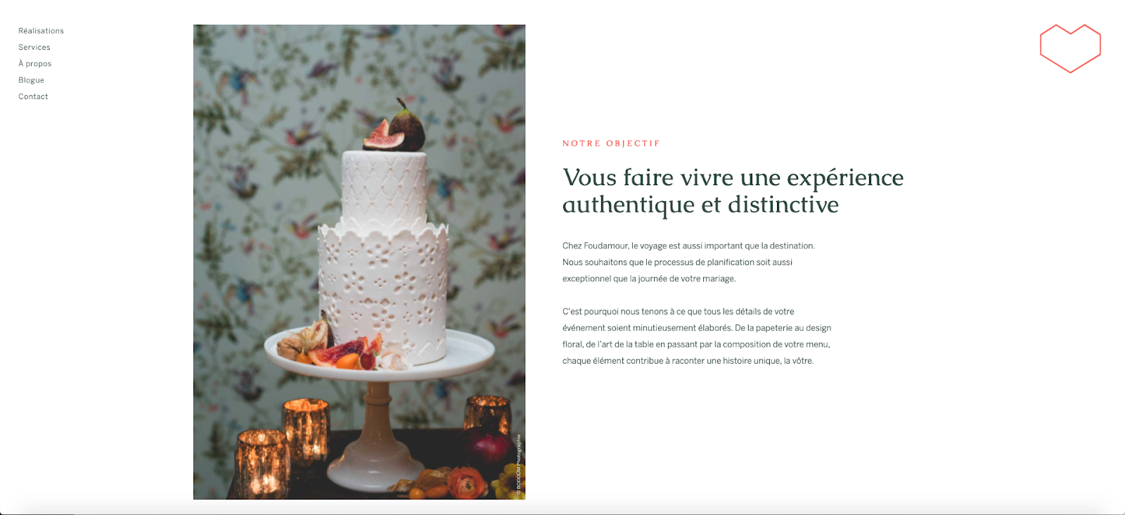
’s website is heavily inspired by print layout, holding on to the familiarity and connection to magazine styled layouts and elements brought to fruition by traditional graphic design, in turn, provoking that desired link to the romanticized tactile experience we’ve all been craving (don’t even get me started about the buttery scroll and easing parallax, swoon). I bet if you switched this type out for Papyrus, you’d get a whole other feeling—maybe despair, or an odd desire to travel to a new planet and discover a .
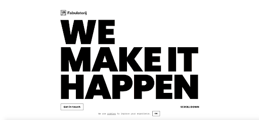

On the more experimental side, we have websites like . The entire homepage is an homage to type being the art itself. By keeping the rest of the design simple, they’re allowing the typography to be the full visual emphasis, matching the mood of the website. Pair it with a highly readable secondary typeface, and you’ve got yourself an award winning website that users and customers both enjoy.
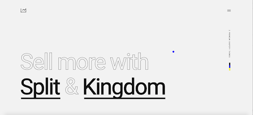
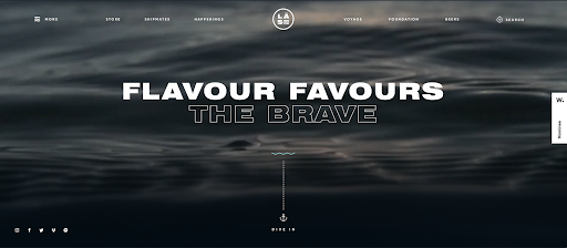
One of the most important rules of web design is visual hierarchy—how each page should be easily grasped quickly. The more important something is, the larger it should be. Think of it this way, New York Times’ titles aren’t 12 point while their body copy is 25 point, and websites are no different. Playing with the importance of hierarchy using filled and outlined pairs is a perfect example of how designers are honoring the consistency of hierarchy needed in web design, while still experimenting with type treatments to make a web page dynamic and modern.
Steve Krug said “ If you’re going to innovate, you have to understand the value of what you’re replacing (or as Dylan put it ‘To live outside the law, you must be honest’), and it’s easy to underestimate just how much value conventions provide… Innovate when you know you have a better idea, but take advantage of conventions when you don’t.”
Watermark believes in being a catalyst for change, and that means understanding the blend of improving with innovating. Why replace the old with something new when the old can provide so much emotion to an otherwise stagnant website?
2021 is the year we put value back into the tried and true and provide our users with the emotional connections they most crave.


