//
Apr 19, 2023
The Yin and Yang of Design: Achieving Balance in UX and UI Design
As the ancient Chinese philosophy of Yin and Yang suggests, two opposing forces can come together to create balance and harmony.
Success in the design world requires a balance between the user's experience (UX) and the functionality of the design interface (UI).
In this article, we explore the relationship between UI and UX design, and how they work in . We will look at how they work together to create balanced, harmonic, and intuitive online experiences.
User-Centric Design: The Magic Behind Engaging and Intuitive UX Experiences

UX design is creating a product or service that meets the needs of users. It involves studying user behavior and making a design that is easy to use. This design should consider usability, accessibility, and visual design to make the final product functional and beautiful.
The goal of UX design is to make users happy by giving them a good experience.
The 5 Benefits of UX Design for Business Success
In today's digital age, user experience (UX) design has become essential to creating successful products and services.
Making UX design a priority can have many benefits, including:
1. Improved User Satisfaction
Users will be satisfied with the product when they can quickly and easily navigate a website or an app. This increases user engagement and drives business growth.
2. Increased User Engagement
A good user experience can result in increased engagement. A well-designed product with a seamless user experience can encourage users to interact with the product more frequently, spend more time on the product, and ultimately convert into customers.
3. Enhanced Brand Loyalty
A positive user experience can leave a lasting impression on users, who are more likely to return to the product or service in the future. By providing users with a seamless and enjoyable experience, businesses can build a loyal customer base that is more likely to recommend their products or services to others.
4. Reduced Development Costs
By focusing on user needs and behaviors early in the product development process, businesses can identify and address issues before they become more costly to fix later on. Well-designed products can also reduce the number of customer support calls and requests, further reducing costs.
5. Competitive Advantage
By prioritizing UX design and investing in user research and testing, businesses can differentiate themselves from competitors and attract new customers.
The 7 key components of UI design for business success
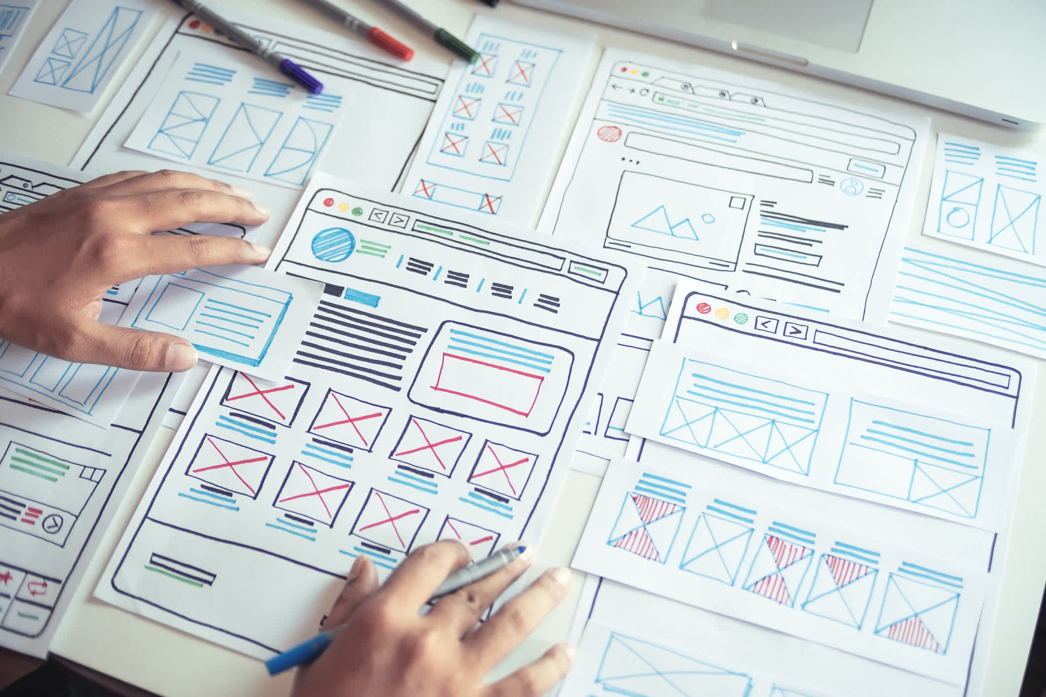
UI design refers to the process of designing the visual and interactive elements of a product, app, or website. It involves creating a design that is aesthetically pleasing, easy to use, and aligned with the brand's identity.
1. Layout
This refers to the arrangement of elements on a screen or page. A good layout should be easy to understand and navigate, with a logical flow that guides users through the content.
2. Color theory
Color theory in UI design is important. It involves choosing colors that reflect the brand's identity and create a visual hierarchy. The colors should look good and match the brand's personality. A good color palette can make users feel connected to the brand and affect their opinion of it.
3. Typography
Typography is another crucial component of UI design that involves selecting fonts that are easy to read and aligned with the brand's identity. The font style, size, and spacing should be carefully chosen to ensure readability and legibility. The should be consistent across all design elements to maintain a cohesive and professional look.
4. Visual hierarchy
Visual hierarchy in UI design is important. It helps guide users to important elements and makes content easy to scan and navigate. Using contrast, size, and placement can establish a clear visual hierarchy. This improves user experience and engagement.
5. Icons and graphics
Icons and graphics can be used to visually represent actions, concepts, and ideas. They can make a UI design more engaging and intuitive, helping users to quickly understand how to interact with the interface.
6. Interaction design
Interaction design refers to the way users interact with a UI design. This includes the use of gestures, animations, and other interactive elements that make the user experience more engaging and enjoyable.
7. Accessibility
Accessibility refers to the design of UI elements that make it easy for people with disabilities to use the interface. This includes considerations such as text size, color contrast, and keyboard navigation.
The Importance and Benefits of UI Design
UI design has become increasingly important in recent years, as more and more people are using digital products in their daily lives. The importance and benefits of UI design are:
Improved User Experience
One of the primary benefits of UI design is that it improves the overall user experience (UX). The design of a user interface directly impacts how users interact with a product, and a well-designed UI can make it easier for users to navigate, understand, and use a product. This, in turn, increases user satisfaction and can lead to increased user retention and loyalty.
Increased Conversion Rates
Another important benefit of UI design is that it can increase conversion rates. A well-designed UI can guide users through a product, making it easier for them to complete tasks or make purchases. This can lead to higher conversion rates and ultimately, increased revenue for businesses.
Enhanced Brand Identity
UI design can also enhance a brand's identity by creating a consistent look and feel across all digital products. A well-designed UI can help establish a brand's personality and create a strong visual identity that resonates with users. This can help businesses stand out in a crowded marketplace and build brand recognition and loyalty.
Reduced Development Time and Costs
A well-designed UI can also reduce development time and costs. When the design of a UI is well thought out and planned, developers can work more efficiently, resulting in faster development times and lower costs. This can be especially important for startups and small businesses that have limited resources.
Enables Cross-Platform Compatibility
Finally, a well-designed UI can enable cross-platform compatibility. With more and more devices and platforms available, it's important that digital products can be accessed and used across different devices and platforms. A well-designed UI can ensure that a product looks and works consistently across all platforms, making it easier for users to access.
Wait, Aren’t UX and UI Basically the same thing?
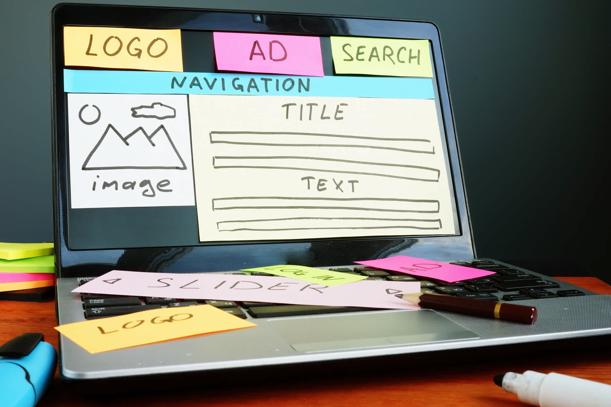
While they are different, they work together to deliver user-centric design. In the world of digital design, the terms "user experience" (UX) and "user interface" (UI) are often used interchangeably. However, they are distinct yet interconnected elements that play a crucial role in creating a successful product.
"User Experience (UX) and User Interface (UI) are some of the most confused and misused terms in our field. A UI without UX is like a painter slapping paint onto a canvas without thought; while UX without UI is like the frame of a sculpture with no paper mache on it. A great product experience starts with UX followed by UI. Both are essential for the product’s success."
The Differences Between UX and UI Design
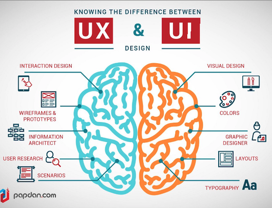
UX design is concerned with how users interact with an interface—whether it be an app, website, or even a piece of hardware.
UX designers help determine how easy it is to use an interface, which means they spend a lot of time thinking about human psychology and behavior—usually applying a .
On the other hand, UI design is more concerned with making sure that elements like buttons and menus look good and make sense. It's about creating consistency so users don't have trouble finding things or understanding what's going on in an app or website.
UI design also involves thinking about how an interface looks overall—how it should function as part of a whole system for interacting with products—but it's often less about psychology than UX design is.
It’s not an either/or proposition. A successful design is one that considers both the experience it creates and how well that experience fits with user expectations.
In this context, it's important to understand the relationship between the two and how they work in harmony to create a powerful, engaging, and relatable experience that fosters customer retention.
Zen and the Art of Digital Design
UX and UI design are interconnected and work together to create a seamless user experience.

Collaboration between UX and UI designers is crucial.
Without good UX design, a product, app, or website may be difficult to use or provide little value to the user. Without good UI design, a product, app, or website may be unattractive or confusing to use.
Balance and harmony are essential elements of not just good design, but great design.
UX and UI designers can work together to achieve balance in design by:
- Understanding the user's needs and goals to create a user-centered design.
- Creating a clear and consistent layout that guides the user's attention to the most important elements of the design.
- Choosing a color palette and typography that reflects the brand's identity and creates a visual hierarchy.
- Incorporating interactive elements that enhance the user's experience and provide value.
Here are some great real-world examples of the relationship between UX and UI design working together to create a one-of-a-kind, consistent, and delightful experience for users.
1. Airbnb *
The charm and success of this lie in its simplicity.
The features that make website a testament to the power of effective UX design:
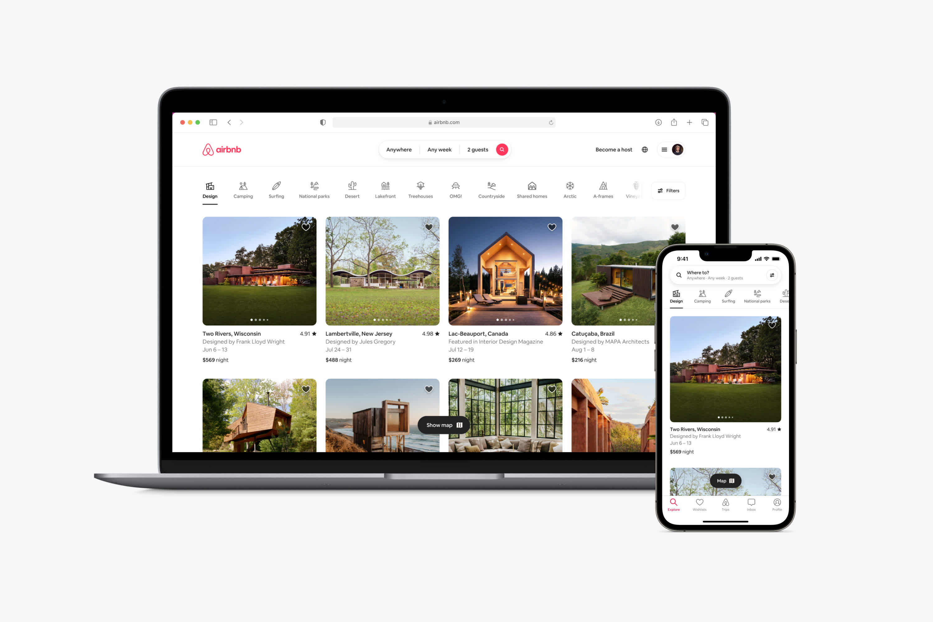
- Intuitive navigation:
Airbnb boasts an intuitive and user-friendly interface that easily guides users through the site. The layout is simple, with clear labels and clickable icons that make it easy to find what you're looking for.
- Easy-to-use search functionality:
Airbnb's search bar is prominent and versatile, allowing users to quickly find a place by filtering their results on multiple criteria—like name or location.
- Relevant and personalized:
Airbnb’s algorithm tracks user behavior and provides highly personalized recommendations based on their previous search history, as well as preferences.
- High-quality images:
High-quality images are large and in focus, representing the space accurately. This builds trust with potential guests, encouraging them to book
- Detailed descriptions of accommodations and user-generated reviews:
Thorough, accurate descriptions of each property and user-generated reviews help buyers make well-informed decisions.
The following are elements of UI design that have made Airbnb a leading example in the travel and hospitality industry:
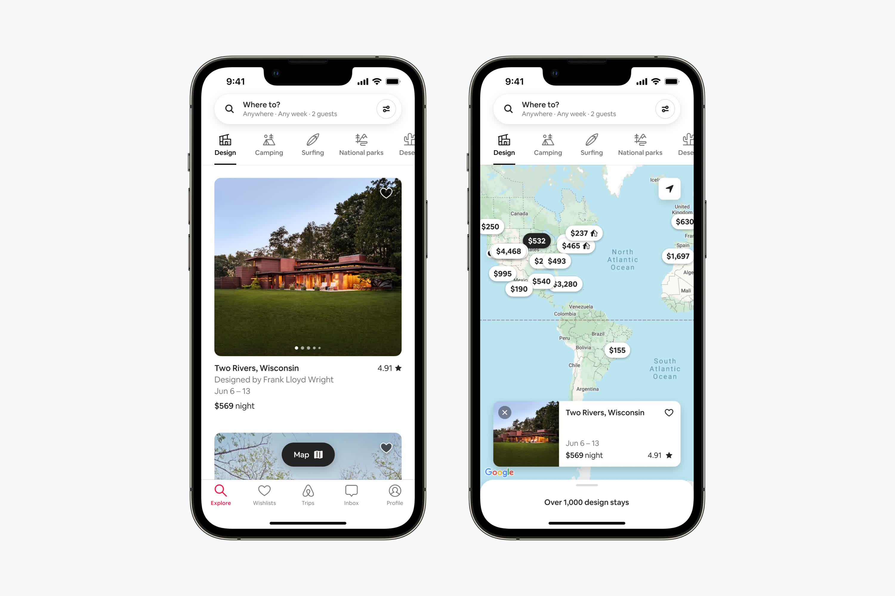
- Consistent and clean design throughout the site, creating a cohesive user experience.
- Effective use of whitespace and visual hierarchy, making it easy for users to identify the most important information.
- Use of bold typography to highlight important information and create a sense of hierarchy.
- A minimalistic design that reduces clutter and distractions, leading to a more focused and enjoyable user experience.
- Effective use of color to create a warm and inviting atmosphere, while also providing visual cues to guide users through the site.
- Consistent use of icons and imagery creates a more engaging and visually appealing design.
- Use of responsive design that adapts to different screen sizes, ensuring a seamless user experience across all devices.
The Takeaway:
With its user-first approach, the company has created a product that is both useful and enjoyable. This has led to increased engagement, customer loyalty—and success.
2. Headspace*
One of the main reasons for success is its excellent UX and UI design, which is intuitive and effective in helping users achieve their meditation goals.
The UX design features that make the Headspace app so effective and enjoyable
- Simplicity
The app has a straightforward and easy-to-use interface that allows users to quickly access the features they need without unnecessary clutter or distractions.
- Ease of use
The success of Headspace rests on its ease of use. The app wouldn’t attract users if it were confusing or hard to navigate—so the company designed it with simplicity and clarity in mind.
- Calming color palette
One of the standout features of the app is its calming . The soft blues and greens used throughout the app create a peaceful and relaxing atmosphere, which is perfect for a meditation app.
- Simple, intuitive icons
Each icon is easy to understand and helps users quickly navigate to the areas of the app they need. This is a great example of how good UX design can make an app more user-friendly and enjoyable to use.
The unique UI design features of Headspace include the following:
- A clear and concise language that's easy to understand.
- Personalized recommendations based on user preferences and habits.
- Seamless integration of audio and video content.
- Option to customize meditation sessions with different themes and lengths.
- Progress tracking and reminders to help users stay on track with their meditation goals.
- Accessibility options for individuals with hearing or visual impairments.
The Takeaway:
The Headspace meditation app is a shining example of good UX/UI design, providing users with that guides them through their meditation practice. Its focus on customization, guided meditations, and progress tracking has helped it become one of the most popular mindfulness apps on the market today.
3. Spotify*

Undoubtedly one of the most popular music streaming services in the world, success can be attributed in large part to its excellent UX design.
The features that make Spotify a great example of UX design:
- Simplicity
The app and website are designed to be as straightforward and intuitive as possible.
- Clear and concise navigation menus
When users can quickly and easily understand the navigation menus on a site, they find what they are looking for faster, increasing user satisfaction and limiting frustration.
- Personalization
Spotify's personalized music suggestions, powered by sophisticated algorithms, enhance user experience.
- Shared Experience
Offering an easy way to create and share playlists enhances users' social experience.
- Consistency
Spotify's consistent UX design across all platforms allows for easy device switching without having to relearn the service.
A deep dive into the features of Spotify’s UI design:
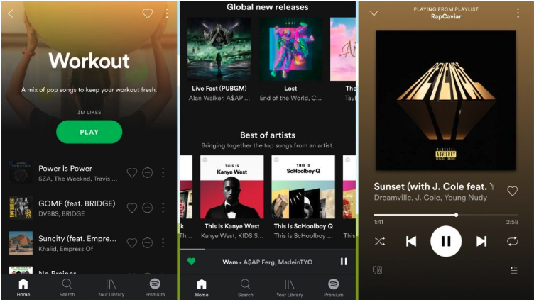
- Dark Mode
Using a is increasingly popular because it enhances user comfort and encourages longer browsing.
- Clear and intuitive button design
Spotify's button design is effective with bright green buttons on dark background for primary tasks and outlined secondary buttons for an easy location without distraction.
- Visual cues to assist the user
Spotify uses size, color, positioning, and alignment to create a visual hierarchy that helps users navigate the app efficiently.
- Consistency
Consistent design language enhances user experience and facilitates intuitive navigation.
How to Get Started with UX/UI Design: Tips and Tricks
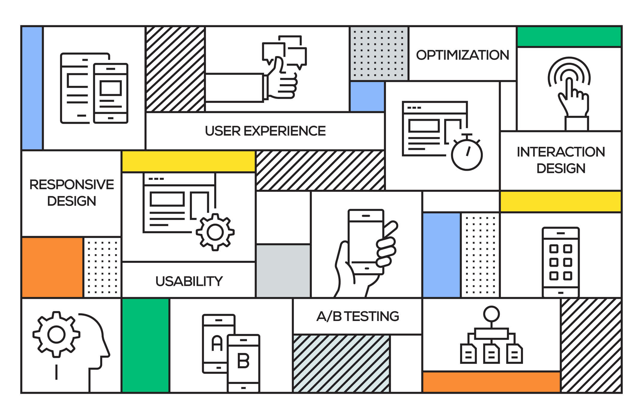
Here are some tips and tricks for getting started with UX/UI design and when it might be necessary to consult a digital designer for a web audit and heuristic evaluation.
1. Research and Define Your Audience
Before you can design an effective website, you must understand your target audience. This means researching your potential users' demographics, needs, and goals. Once you clearly understand your audience, you can start designing a website that caters to their needs and preferences.
2. Create a Clear and Consistent Navigation System
One of the most critical elements of is creating a clear and consistent navigation system. Your website should be easy to navigate, with clear labels and intuitive menus that help users quickly find what they are looking for.
3. Use Consistent Branding
Branding is another essential component of UX/UI design. Your website should have a consistent look and feel, with the same fonts, colors, and design elements used throughout. This will help create a cohesive and memorable user experience.
4. Focus on Usability and Accessibility
Usability and accessibility should be top priorities when designing your website. This means ensuring that your website is easy for all users, including those with disabilities. Consider font size, color contrast, and alternative text for images to ensure your website is accessible to everyone.
Learn More:
5. Test and Iterate
Once you have a design in place, it's important to test it thoroughly to ensure it meets your users' needs. This might involve user testing, , or other feedback-gathering methods. Use this feedback to iterate on your design, making improvements and tweaks until you have a website that meets your users' needs.
When to Consult a Digital Designer for a Web Audit and Heuristic Evaluation
While it's possible to design a website on your own, consider partnering with a digital design team for a web audit and heuristic evaluation when:
- Your Website Isn't Meeting Your Goals
- You're Redesigning Your Website
- You're Launching a New Product or Service
Conclusion: Striking a balance between the forces of UX and UI Design

By considering the Yin and Yang of design, you can create a design that not only looks great but also functions effectively for your users.
Don't be afraid to experiment and iterate on your designs until you find the perfect balance. And remember, your users are at the center of everything you do. By putting their needs and preferences first, you can create a design that truly resonates with them and provides them with a great user experience.
Ready to take your website, landing page, or campaign to the next level?
Our team at Watermark can help you build, design and launch a successful UX/UI-centered website that meets the needs of your users and achieves your business goals.
If you're interested in learning more, we invite you to schedule a Discovery Call with us today. Our team of design experts will take the time to understand your business goals, target audience, and unique needs to create a custom solution that works for you.
Don't settle for a website that falls short of your expectations. Contact us today to schedule your Discovery Call and take the first step towards a successful online presence!
***Disclaimer: Any brand used for example purposes are not affiliated with Watermark nor is Watermark paid to promote them***

