//
Oct 19, 2023
From Concept to Creation: The Beginner's Guide to Website Wireframes
Your website isn't just a generic template; it's a virtual gateway to your brand.
Crafting a website that seamlessly blends aesthetics with functionality is no simple task. While there are numerous DIY web design templates and services available, the challenge of creating a website that truly stands out remains.
Where do you begin to ensure your website looks great and works perfectly? Website wireframes hold the answer. They're like the guiding stars of web design.
In this guide, we'll teach you website wireframing from start to finish. You'll gain tools and knowledge that can help your projects succeed.
But first, what are website wireframes and why do they matter?
What Are Website Wireframes?

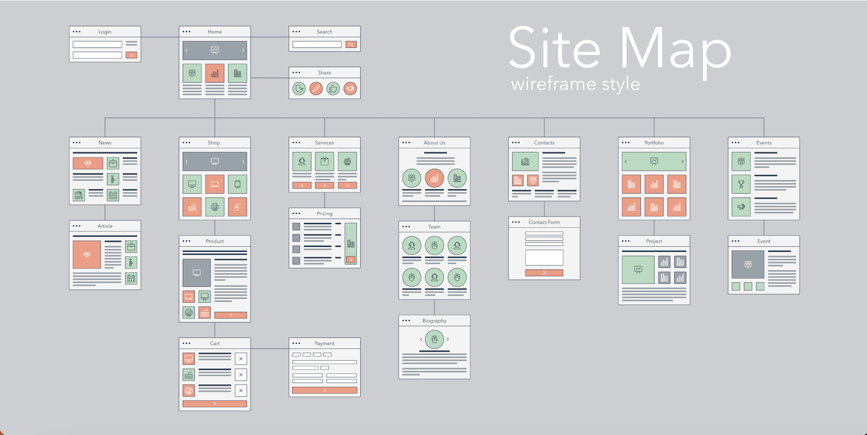
Website wireframes are like blueprints for your website. They provide a simplified visual representation of a webpage's layout, structure, and content placement.
Think of them as the architectural plans for a building. Without these blueprints, constructing your website can quickly become inefficient and chaotic.
Why Do Website Wireframes Matter?
In web design, wireframes are essential for several reasons:
- Clarity and Direction: They offer a clear roadmap for the entire design process.
- Early Problem-Solving: They allow you to identify and address design issues before investing significant time and resources.
- User-Centric Approach: They help you prioritize the user experience (UX) by planning how users will interact with your site.
Building the Foundation of your Website With Effective Wireframes: Tips to Get Started
1. Layout
Think of the layout as the blueprint that determines where different elements go on your webpage.
Practical Example of Layout:
Imagine you're designing a new house. The layout would establish where you want the living room, kitchen, bedrooms, and bathrooms to be located.
Similarly, on a webpage, the layout is responsible for arranging essential components like headers, navigation menus, content sections, and footers.
By organizing these elements in a well-structured layout, you create an intuitive and enjoyable user experience for your visitors. Just like a well-designed home, a thoughtful layout sets the stage for a cohesive and inviting website.
2. Navigation

Navigation is like the of your website. It helps users find their way around and explore different areas seamlessly.
Practical Example of Navigation:
Picture yourself in a massive shopping mall with no signs pointing you to the perfect store for your needs. Frustrating, right? Well, the same goes for websites.
Navigation in wireframes involves creating menus, links, buttons, and interactive features that enable users to effortlessly navigate through your digital space.
Effective navigation ensures that users can easily find what they're looking for, leading to a more satisfying experience.
So, just like a well-marked shopping mall, a well-designed site navigation system guides users to their desired destinations efficiently.
3. Content Hierarchy
Content hierarchy is like having a conversation where you present information in a structured and logical manner.
Practical Example of Content Hierarchy:
Imagine designing a website for a B2B software company. Your goal is to communicate the software's value to potential business customers clearly.
In this scenario, content hierarchy organizes the website like this:
- Homepage Message: Like a headline in marketing, the homepage highlights the software's key benefits, such as productivity and cost savings.
- Sectional Breakdown: The site has sections for features, case studies, pricing, and testimonials.
- Detailed Subsections: Under each section, detailed information, visuals, and real success stories are provided.
- Simple Navigation: The menu guides users through the site logically, making it easy for them to find what they need.
Content hierarchy, applied to web design, helps create a user-friendly and informative B2B website, guiding visitors through a structured conversation that informs and engages them effectively.
The key is to understand the needs of your audience and tailor these elements to provide the best user experience possible. So keep experimenting, iterating, and putting your creative spin on these concepts to make your website truly stand out!
4. Usability Testing

This method is used to with which users can interact with a product, such as a website or software application.
It involves observing real users as they perform specific tasks on the product, providing valuable insights into its user-friendliness and identifying areas for improvement in the design and functionality.
Practical Example of Usability Testing:
Imagine you've designed a wireframe for an e-commerce website. It looks great on paper, and you believe it offers an intuitive shopping experience. However, to ensure it truly meets your users' needs, you decide to conduct usability testing.
In this scenario, you recruit a group of potential customers, provide them with tasks like finding a specific product or completing a purchase, and observe their interactions with the wireframe.
You quickly discover that users struggle to locate the shopping cart icon, and some find the checkout process confusing.
Thanks to usability testing, you identify these pain points early on and make necessary adjustments to the wireframe, such as improving navigation and clarifying the checkout steps.
As a result, your website's user experience is enhanced, leading to higher customer satisfaction and increased conversions.
5. Prioritize User Experience (UX)
User Experience (UX) refers to the overall experience that a person has when interacting with a product, service, or system, typically in a digital context like a website or mobile app. It encompasses every aspect of the user's interaction, including their feelings, perceptions, and responses.
UX design focuses on creating products that are easy to use, efficient, and enjoyable, with the goal of providing users with a positive and meaningful experience.
It involves understanding user needs, conducting research, designing user interfaces, and continually refining and optimizing the product to meet those needs and expectations effectively.
A well-crafted UX aims to ensure that users can achieve their goals with minimal friction and that they have a satisfying and memorable interaction with the product or service.

Practical Example of UX:
Consider a B2B web design agency specializing in creating websites for corporate clients. They decide to to deliver exceptional value to their clients using these strategies:
- Client Research: The web design agency conducts research by engaging with their B2B clients, including corporate marketing teams and business owners. They seek to understand the objectives, , and unique challenges of each client.
- Customized Design: Based on the research findings, the agency's UX designers craft custom website designs tailored to each client's needs. These designs prioritize intuitive navigation, clear messaging, and efficient conversion paths.
- User Testing: Before finalizing the designs, the agency conducts usability testing with representatives from their B2B clients. Test participants interact with the prototype websites, providing feedback on ease of use and clarity of information.
- Design Refinement: Taking the feedback into account, the agency refines the website designs. They optimize the user interface (UI) elements, improve mobile responsiveness, and ensure that the websites align with each client's brand identity.
- Deployment: The agency deploys the newly designed websites for their B2B clients. The websites are launched with improved UX features, such as simplified contact forms, clear calls to action, and user-friendly content management systems.
- Post-Launch Support: The agency continues to work closely with its B2B clients, providing post-launch support and addressing any UX-related issues or feature requests. They also monitor website analytics to identify areas for further improvement.
In this scenario, the B2B web design agency's commitment to UX design results in highly tailored and user-friendly websites for their corporate clients.
These websites effectively engage target audiences, enhance user satisfaction, and contribute to the success of their clients' businesses in the online space.
Getting Started with Effective Wireframing: Step-by-Step

Now that we've explored the significance of wireframing and grasped its fundamental principles, let's delve into the practical aspect: how to initiate the wireframing process and identify the essential tools and resources required to begin crafting effective wireframes.
Step 1. Define Your Goals and Objectives
Before diving into wireframing, it's essential to understand the goals and objectives of your website. What is the purpose of your site, and what do you want users to achieve? Identifying these goals will guide your wireframe creation process.
Step 2. Identify Your Target Audience
Consider the needs, preferences, and expectations of your target audience. Who will be using your website, and what are their pain points and desires? A user-centric approach ensures that your wireframes cater to the intended users.
Step 3. Plan Your Content Hierarchy
Determine the hierarchy of content on your website. What information is most important, and how should it be presented? Sketch out the placement of headers, menus, images, and text to create a logical flow for users.
Step 4: Structuring Your Wireframe with Simplicity and Grid Design
Begin by establishing a grid system that defines the layout of your wireframe. This grid serves as the backbone, ensuring consistency in design elements and spacing.
Within this structured framework, arrange components like headers, navigation bars, and content sections. Simplicity is key here – steer clear of clutter and excessive details.
Instead, use placeholders for images and text to convey the layout without delving into content specifics. This combination of grid design and simplicity creates a clean and effective wireframe.
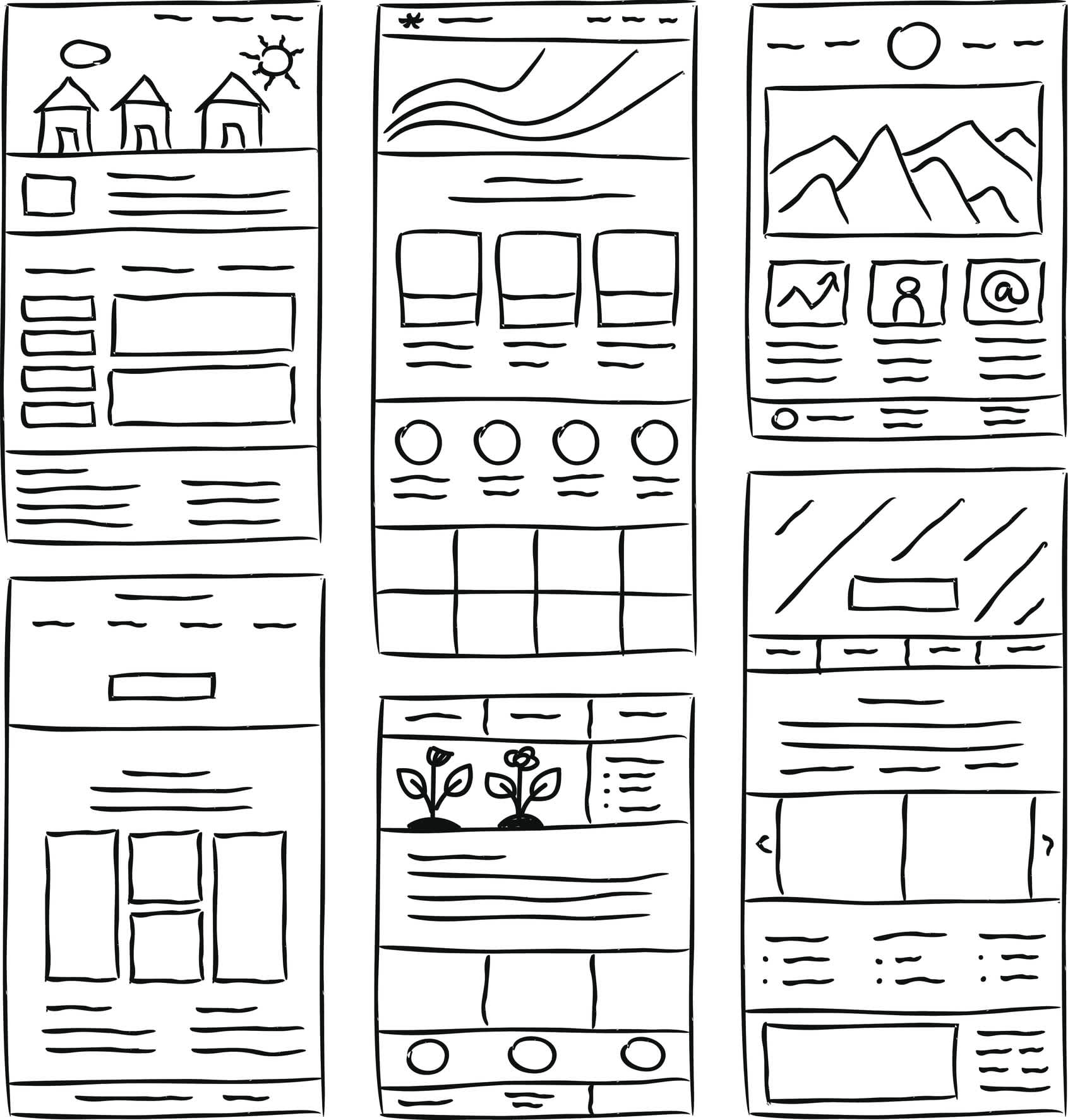
The image below provides an excellent illustration of the grid's simplicity.

Step 5. Incorporate Feedback
Wireframing is a collaborative process. Seek feedback from team members and stakeholders to refine your wireframes. Their insights can help identify potential issues and improvements.
Step 6. Iterate and Refine
Wireframes are not set in stone. Be prepared to iterate and refine your wireframes based on feedback and results. Flexibility in design is key to achieving a user-friendly and effective website.
Step 7. Finalize Your Wireframes
Once you've refined your wireframes, finalize them with attention to detail. Ensure that they accurately represent your website's structure and functionality.
By following these steps, you can create wireframes that serve as a strong foundation for your web design projects.
Effective wireframes not only make the design process smoother but also enhance the overall user experience, resulting in a successful website that meets your goals and delights your audience.
Tools and Techniques for Creating Website Wireframes
Selecting the appropriate tools and techniques plays a pivotal role in the process of crafting website wireframes, significantly influencing the efficiency and effectiveness of your web design project. Making informed decisions in this aspect ensures that you can seamlessly translate your creative vision into a well-structured wireframe.
Let's explore your options:
Digital Tools
Digital tools like , , , and offer a wide range of features for creating digital wireframes. They enable easy collaboration and version control, making them suitable for team projects.
Hand Sketching
Some designers prefer the simplicity of starting with pen and paper to quickly sketch out their ideas before digitizing them. This can be effective for brainstorming and initial ideation.
Wireframing Kits
Wireframing kits and templates, available both online and in print, provide pre-designed elements for building wireframes more efficiently. They can be particularly helpful when time is of the essence.
For those new to wireframing, the task of choosing the most suitable tools and techniques can appear daunting.
It's essential to weigh several factors, including the project's complexity, your team's preferences, and your familiarity with design software, when making these decisions.
Which brings us to our last and final point…Don't hesitate to seek assistance or guidance when needed; it can be immensely beneficial.
Utilizing Expertise to Streamline Wireframing
As you embark on your wireframing journey, remember that expertise holds significant importance. Don't hesitate to explore the invaluable assistance of a equipped with the right tools, abundant resources, and extensive experience.
This collaboration streamlines your wireframing process, boosts its efficiency, and can lower overall costs. Engaging with professionals grants you access to a wealth of knowledge that empowers you to navigate through common beginner mistakes and obstacles.
Their insights can ultimately guide you in crafting highly effective and polished wireframes, laying a strong foundation for a successful web design project.
The Takeaway: Empower Your Web Design with Effective Wireframes
Website wireframes are an indispensable component of web design, serving as the foundational blueprint for crafting user-friendly and visually appealing websites. These skeletal outlines offer a clear and organized structure, giving designers a roadmap to follow in the intricate maze of web development.
They provide a pivotal sense of direction, helping to streamline the design process, minimize ambiguity, and ensure that the end result meets user expectations.
In your journey from concept to creation, website wireframes act as the structural backbone, facilitating the seamless integration of content and functionality while fostering collaboration and synergy among your design team.
Mastering the art of wireframing is a fundamental step toward delivering exceptional web experiences.
Enhance Your Web Design with Watermark
Our award-winning, user-centric approach seamlessly blends functionality with visual appeal. Explore and uncover our .


