//
Sep 23, 2022
Good and Bad Data Visualization in Business Reporting
It’s that time of year. Your employees, customers, and stakeholders want to hear from your company. What’s the best way to deliver important information in a digestible and visual way?
Data visualization in your like infographics, white papers, , Corporate Social Responsibility (CSR) or Environmental Social Governance Reports (), and other corporate collateral.
Data visualization is a powerful tool used to increase your marketing performance. You can make the most out of your data by presenting it in a relevant, understandable, and honest way.
This article will cover all you need to know what data visualization is, why it is important for marketing analytics, and how it can make or break your business reporting.
Good data visualization is targeted and actionable
How is data visualization targeted?
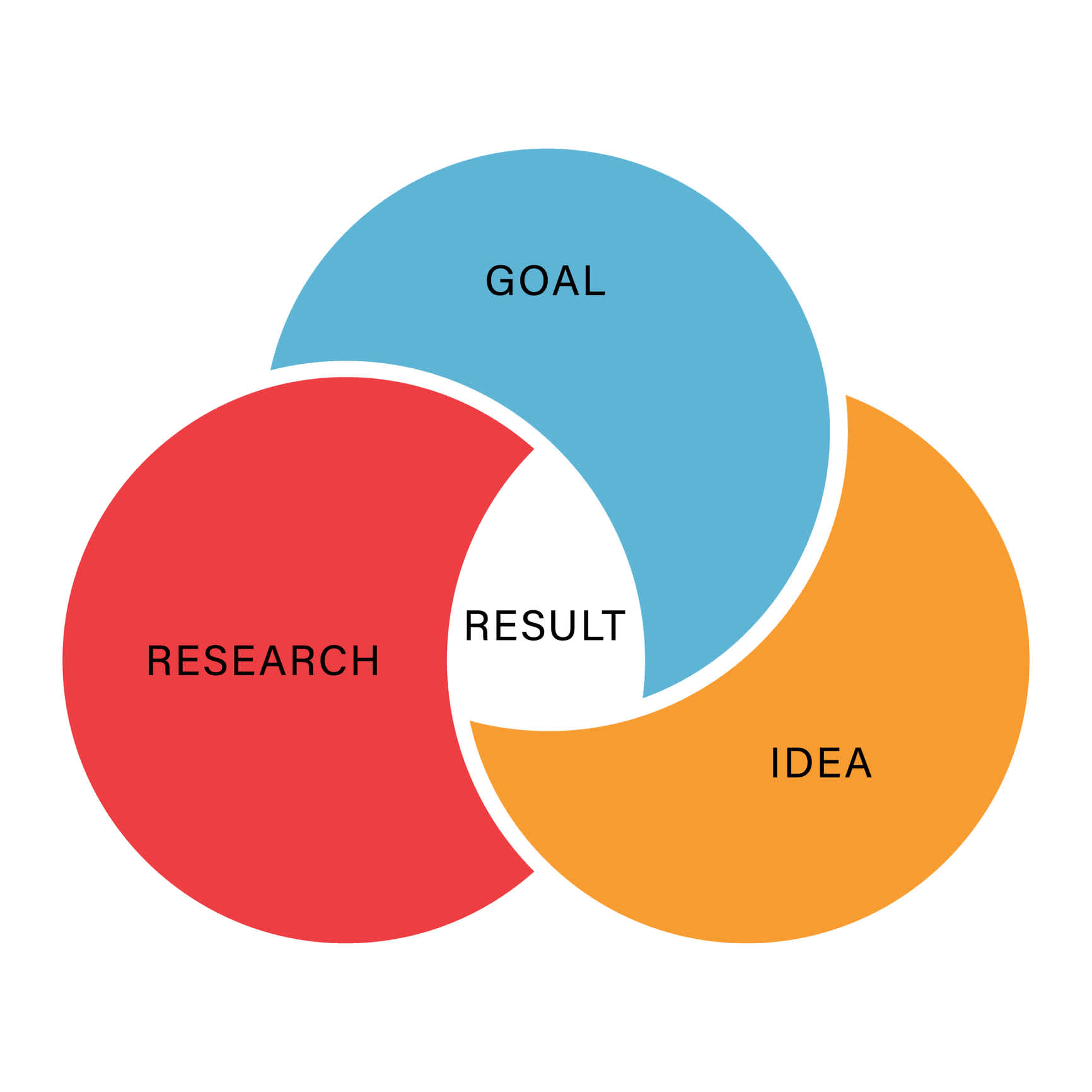
Data visualization focuses on specific goals, metrics, and target audiences.
You should be able to answer questions like:
- Who is this for?
- What do they need to know?
- Why do they care?
- How will this help them achieve their goals?
- What do they want to do with the information they get from this visualization?
- How can we make it easier for them to take action on what they see in the visualization?
- How can we help them understand what they're looking at?
about the importance of planning, development, and deployment when crafting a memorable Annual Report.
How is good data visualization actionable and targeted?
Good data visualization allows users to quickly identify patterns and trends in your data, which helps them make better decisions about how to market themselves or their products/services.
Actionable and targeted data visualization will tell your data story with strong and clear that show movement: are you above or below your targets? Are you moving in the right direction?

You can also show action using color and custom indicators like numbers and visuals like arrows that are clear and simple to understand.

Designing an Annual Report?
Here are that stands out.
Bad data visualization does not offer a clear takeaway

Bad data visualizations are often challenging to understand because they aren't designed with the user's needs in mind—they're created by experts who think that everyone thinks like them!
Examples of bad data visualization include:
- Charts or graphs that have too many elements or are too complex for anyone but an expert to understand
- Charts or graphs with too much or too little information to be useful
- Charts with lots of text but no visual elements at all
- Charts and graphs without labels or titles, so you can't tell what they mean without looking at them closely first (and even then, they might still be hard to understand)
- Misuse of colors; either adding too many or not enough

Good data visualization invokes the senses

When conveying complex information, it's essential to use your audience's sensory perceptions to help them connect between what they're seeing and what they already know.
There are many ways that you can do this:
- Making sure that the color of your visualization is appropriate for the subject matter

- Using infographics to help people understand things that may be difficult to comprehend
- Choosing a
- Making sure that the layout follows a logical pattern

Bad data visualization is unintuitive and opaque
If you're not an expert in the field, it's hard to know what's going on.
If data has been presented in a way that makes it unclear what your audience should look for, your data — and your audience— will be lost.
Need an Annual Report, Corporate Social Responsibility, or Environmental Social Governance Report? Here are .
Good data visualization tells a story in which your audience is the main character

You may think that you're just showing your audience a bunch of numbers and graphs, but what you're doing is.
The most effective visualizations engage the user and tell them something they care about—something they can use.
The best way to do this is by focusing on the end user. What do they want to know? What do they need to know? How can you help them? Your data visualization design should be able to answer all of these questions.
Bad data visualization tries to be a one-size-fits-all solution
It's tempting to think that everyone looks at data in the same way, but the truth is that people see things differently. Each of us has our own unique perspective and way of interpreting information.
If your visual data isn't tailored to the needs of each user, you risk sending them off on the wrong path or confusing them with too much information.
The best way to do this? Test!
Create multiple versions of your visualization, then ask people for feedback on each one.
Want to stand out in your corporate communications? Find out how our can help!
Good data visualization plays to the limitations of human cognition
Data visualization for business reporting is one of the
Data visualization is a powerful tool for making sense of large amounts of information. It helps us process data quickly and easily, and it can help us make decisions based on information that would otherwise be overwhelming.
Think back to all the charts and graphs you saw in school. Most likely, your eyes glazed over if the information didn't feel relevant to you or was too complicated to comprehend. You don't want your audience to do the same thing with the data you're presenting!
There are some limitations to how much we can take in at once. When we look at a table or a graph, our brains have to work harder because they need to create meaning from each element or piece of data.
When we look at a good data visualization, however, our brains can fill in some gaps between elements because they are primed with visual cues from other parts of the graph or chart.
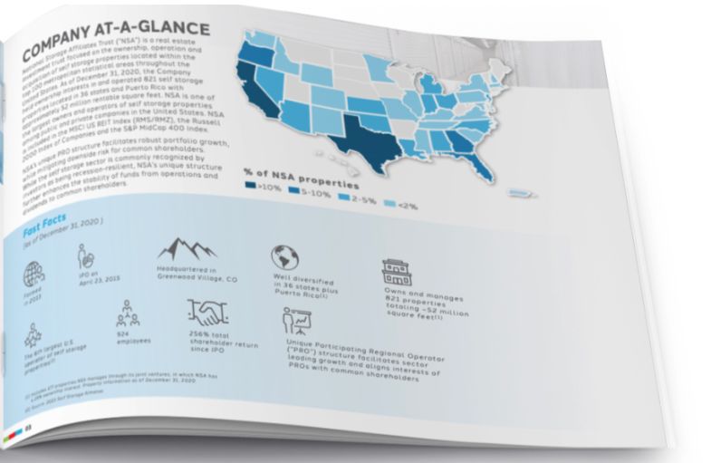
Good data visualization plays on those cognitive limitations so that viewers don't have to spend any more time than necessary trying to make sense of what they're seeing.
What are the best data visualization tools to use?
A data visualization tool is software with various features that you can use to turn your data input into a visually appealing and compelling graphic.
The best tools to use for data visualization must be able to support a variety of visual styles for charts and graphs, easy to use, and be capable of large volumes of data input in a single display.
Some of the most popular data visualization tools are:
This , but all data visualization offers different features while maintaining the same function: taking data input and graphically altering it.
Suppose you're having difficulty picking the right data visualization tool for your business reporting needs. In that case, a corporate communications marketing agency can help to steer you and your data in the right direction.
Conclusion
When it comes to business reporting, the right visuals can be a game changer — and there's no excuse to get it wrong if you're applying good data visualization best practices and leaning on an agency with in-house, corporate communications experience.
Dive into with Watermark

See our latest work in corporate communications:
today to set up a discovery workshop.

